What's your hometown's parallel? Incredible map reveals the surprising cities at identical latitudes - including Edinburgh and Moscow
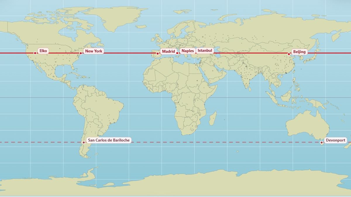
Most of us can place our hometown on a map – but have you ever thought about which cities lie parallel?A new map lets you see the surprising places around the world that lie on the same latitude as you.It reveals that Edinburgh and Moscow both sit at 56°N, while Vancouver and Paris straddle the same 49.3°N latitude.New York and Madrid can both be found at 40.9°N, along with Naples, Istanbul and Beijing.Meanwhile in the southern hemisphere, Buenos Aires and Perth are parallel at 32.2°S.'I've made a super simple website where you can check which cities lay on the same parallel, and also the mirrored parallel on other hemisphere,' X user @vicnaum, who created the map, said.'You can expect the same sunlight hours (longer nights, shorter days, etc) and similar sun power there).'So, what's your hometown's parallel? Use the map here to find out. The fascinating map shows New York, Madrid, Naples, Istanbul and Beijing can all be found at 40.9°N New York (left) and Madrid (right) can both be found at the same latitude, meaning they share the same length of daylightBaffled users who tried out the map have shared their reactions online.One person commented that they 'get the same amount of sunlight as Antarctica'.Another said: 'When you realise at 45 years old that Marseille and Toronto are practically on the same parallel.'One user said they had 'no idea Orlando and Delhi were at the same latitude'.And someone else wrote: 'As you freeze you're a**e off in Chicago keep in mind it's the same latitude as Madrid.'Other parallel places include London and the Canadian city of Saskatoon, which both sit at 52.1°N.Andorra, in the Pyrenees Mountains between France and Spain, sits at the same latitude as Chicago.And the vibrant Brazilian city of Rio de Janeiro is parallel with the remote Australian town of Alice Springs. Meanwhile in the southern hemisphere, Buenos Aires and Perth are parallel at 32.5°S, the map shows Buenos Aires (left), the capital of Argentina, is a bustling metropolis of over 16 million people. It shares a latitude with Perth, in Australia (right) Parallel places Edinburgh and Moscow (56°N)London and Saskatoon (52.1°N)Vancouver and Paris (49.3°N)Chicago and Andorra (42.6°N)New York, Madrid, Istanbul, Naples, Beijing (40.9°N)LA and Baghdad (33.7°N)Orlando and New Delhi (28.5°N)Miami and Taipei (25.4°N)Honolulu and Hong Kong (21.4°N)Quito and Singapore (0.1°N)Rio de Janeiro and Alice Springs (23.8°S)Buenos Aires and Perth (32.2°S) Places on the same latitude generally experience the same length of daylight on any given day.However, they do not experience sunrise and sunset at the same time, nor do they necessarily have the same amount of actual sunshine due to weather conditions.Generally, the further you move from the equator, the more dramatic the seasonal changes in daylight hours.Meanwhile the exact clock time of sunrise and sunset depends how far east or west somewhere is and local time zones.Experts have previously revealed that the Mercator projection – the standard commercial and educational map used around the world – is heavily skewed. The popular map shows North America and Russia as both larger than Africa, when in reality Africa is three times bigger than North America and significantly larger than Russia too. A climate data scientist at the Met Office created a new representation to show what the world really looks like. The updated map shows that many countries – including Russia, Canada and Greenland – are not nearly as big as we think.
Last year, African nations demanded that the 'distorted' world map be redrawn to show the true scale of the continent. The African Union (AU) has backed a campaign to end the use by governments and international organisations of the 16th–century Mercator map in favour of one that more accurately displays Africa's size.The 55–nation bloc has accused the map of skewing continent sizes, enlarging areas near the poles like North America and Greenland while shrinking Africa and South America.They argue the distortion leads to an underplaying of the size and importance of Africa, while disproportionally accentuating the scale of America and Europe to make them look larger than they are.'It might seem to be just a map, but in reality, it is not,' AU Commission deputy chairperson Selma Malika Haddadi told Reuters, saying the Mercator fostered a false impression that Africa was 'marginal', despite being the world's second–largest continent by area, with over a billion people.Such stereotypes influence media, education and policy, she said. The campaigners argue that Africa's diminished scale on the map breeds harmful misconceptions about its geopolitical and economic significance. WHAT IS WRONG WITH THE MERCATOR MAP? Africa is around 14 times larger than Greenland and yet on the map both are almost same size.Brazil is more than five times larger than Alaska, yet Alaska is larger than Brazil on the map. The familiar 'Mercator' projection (pictured) gives the right shapes of land masses, but at the cost of distorting their sizes in favour of the wealthy lands to the northThe map suggests that Scandinavian countries are larger than India, whereas in reality India is three times the size of all Scandinavian countries put together.While it looks like Europe is larger than North America on this map, in reality the reverse is true. Russia also isn't as large as it is depicted, with Africa larger than Russia in reality.