Remember me



Experience the disco-inspired branding for DJ Filguz designed by Pedro Faria, Jean Rosa, and Leandro Santana. A visual trip of pure music.
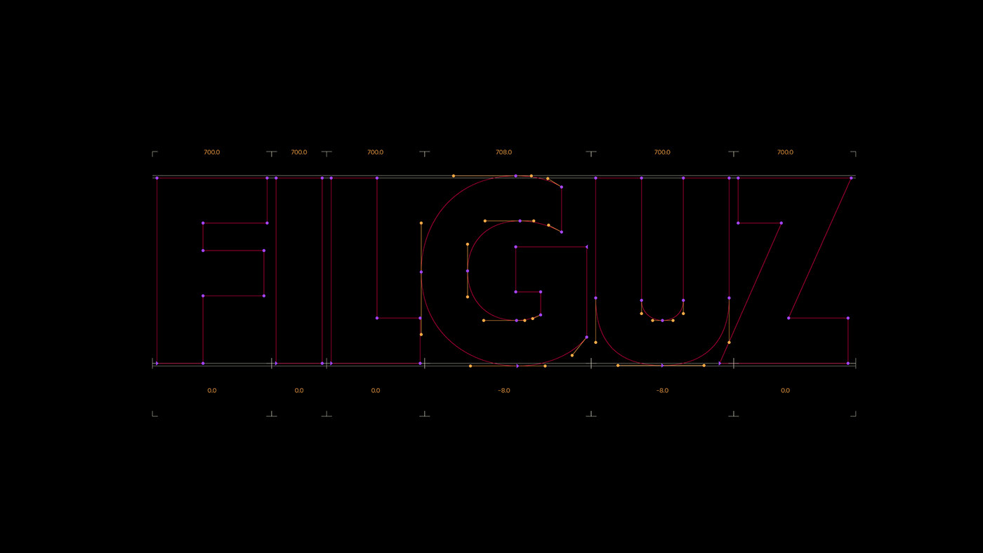
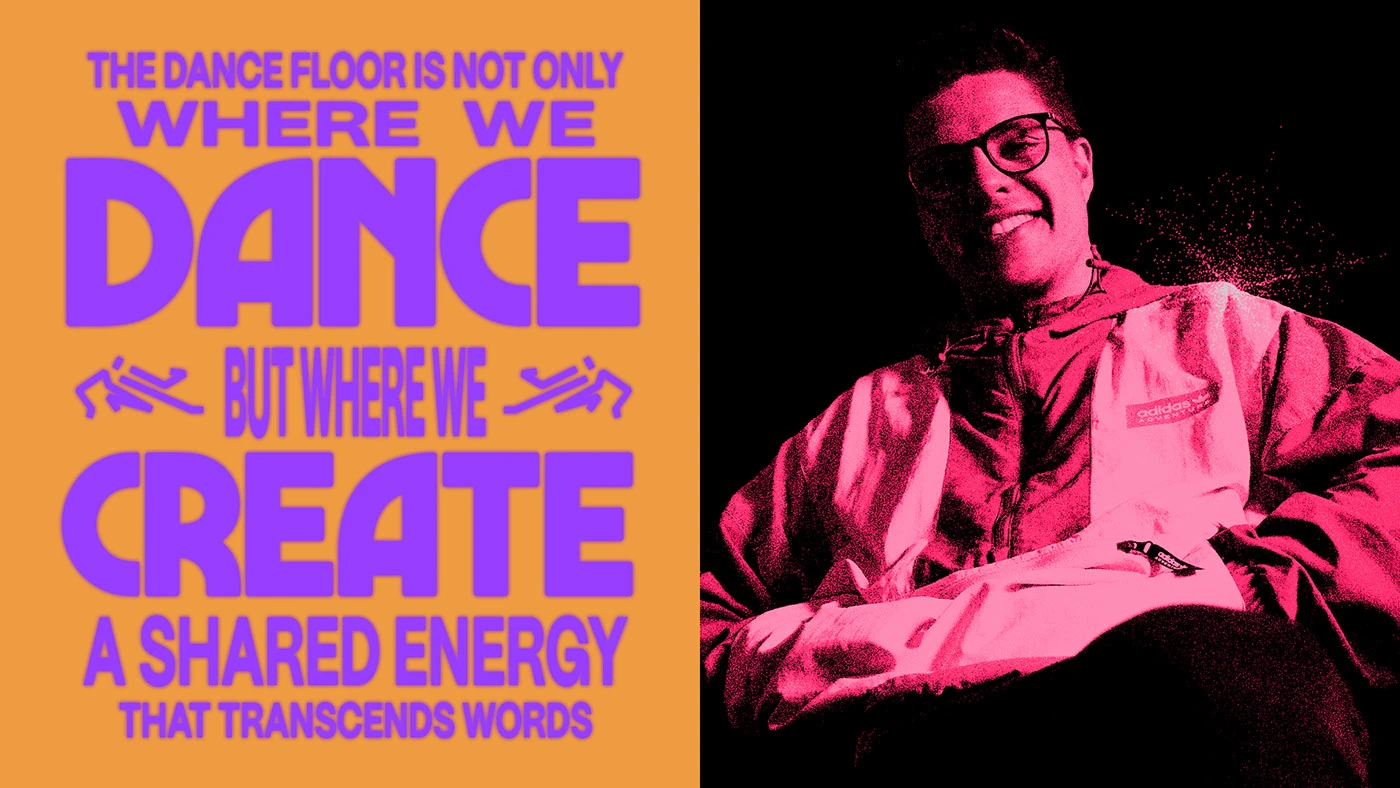
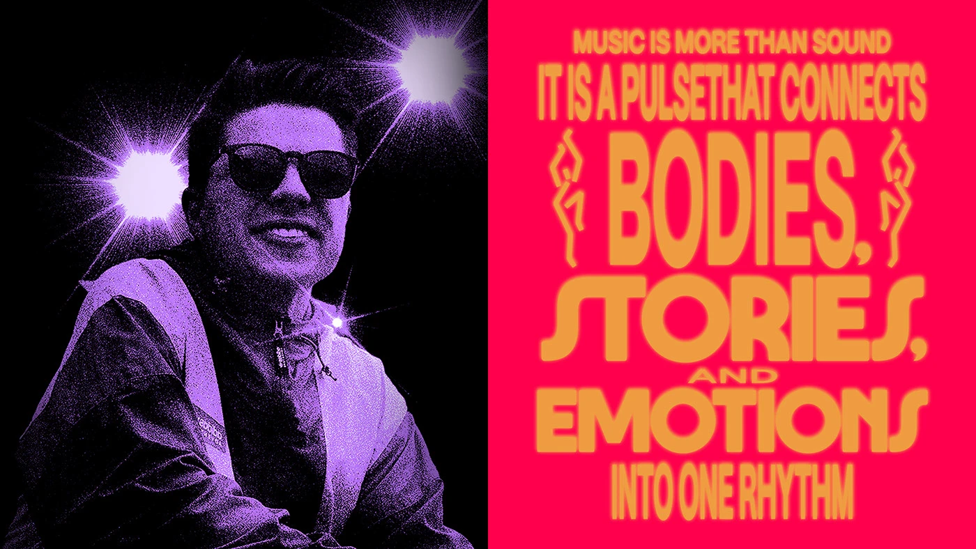
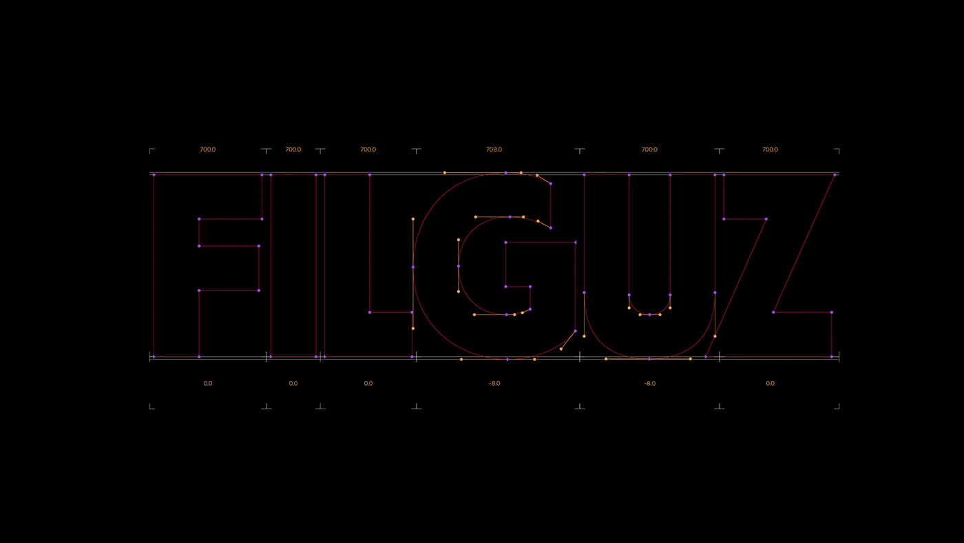
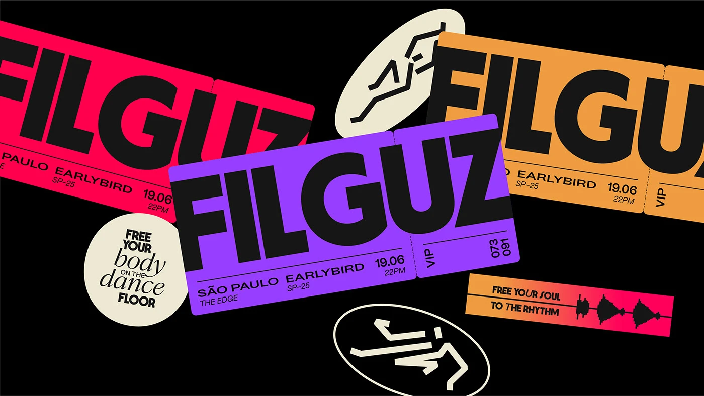
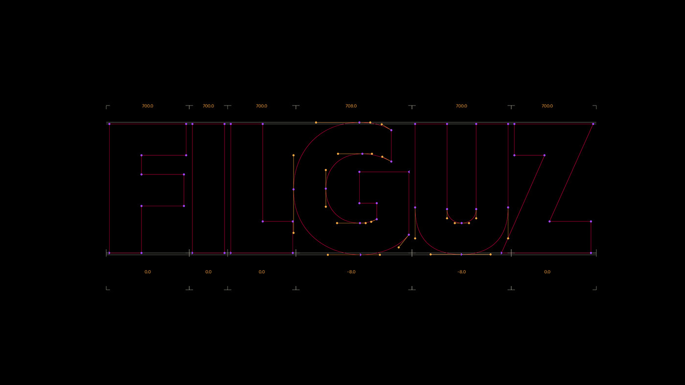
Pedro Faria, Jean Rosa, and Leandro Santana built a visual system that feels alive. High-contrast shapes and bold layouts capture the energy of the dance floor. The typography holds the space with authority. Strong, blocky sans-serif letterforms pair with playful illustrations of dancers and music. A color palette of deep blue, warm orange, and cream establishes the tone. This music branding work rejects quiet minimalism in favor of loud, tactile expression. The team developed distinct visual stamps that repeat across the project. Instead of following clean digital trends, the studio opted for a physical, print-like aesthetic that works well across both digital screens and physical merchandise.
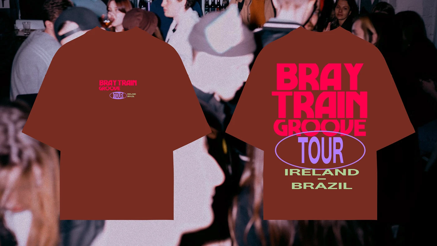
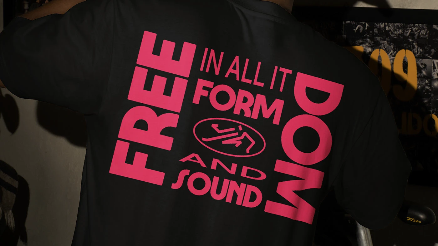
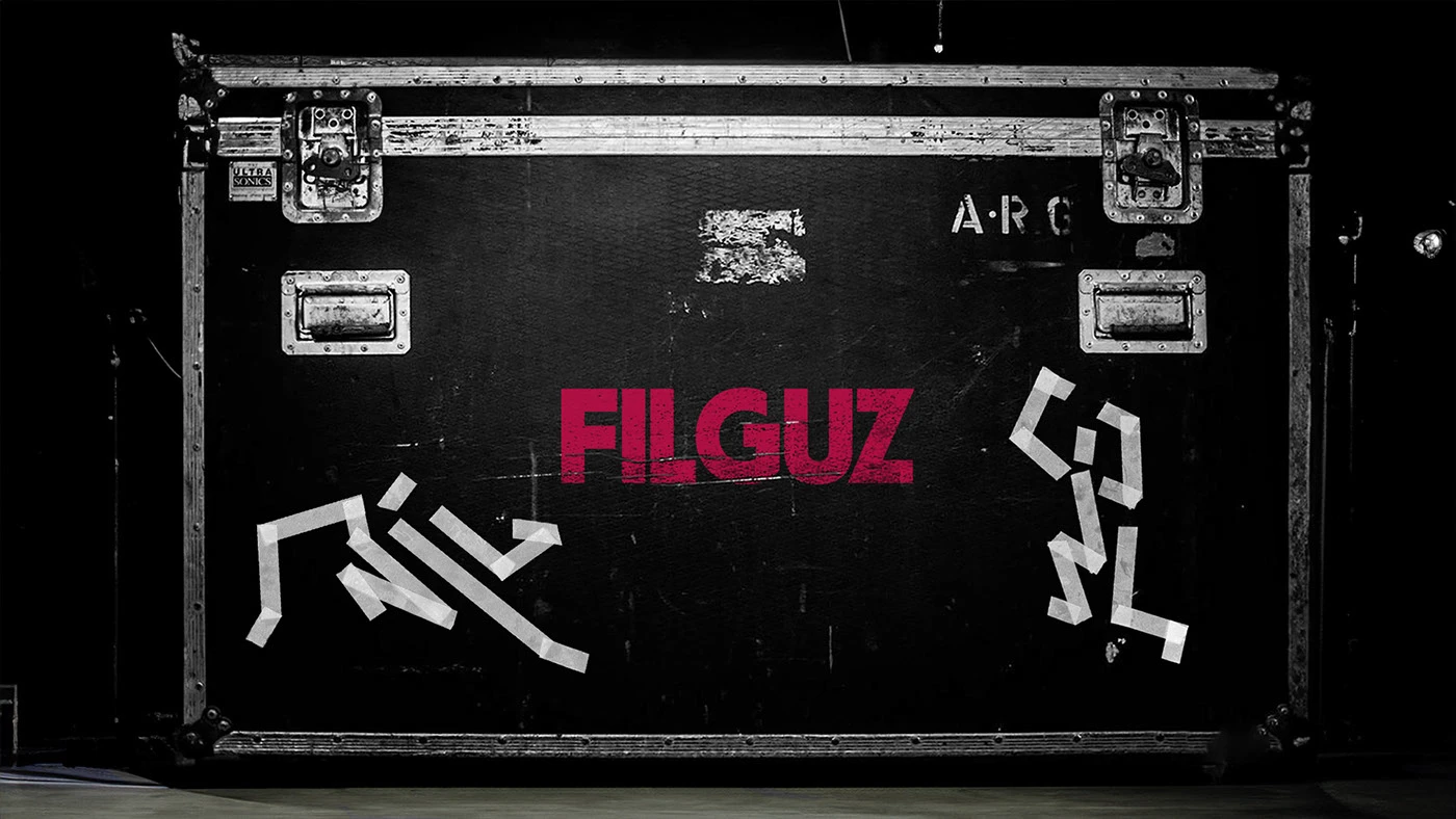
A branding system for an artist needs to live beyond the album cover. The design team created a flexible set of assets. These scale effortlessly from small digital screens to large event banners. We see custom patches, branded shirts, and textured stickers that invite touch. The illustrations feel organic and loose, matching the free-flowing nature of house electronic music. Each graphic asset functions as a standalone sticker or a repeating pattern. This clever design decision allows the brand to remain recognizable across diverse mediums. It avoids the typical repetition of corporate identities. This approach makes the branding dynamic.
Ultimately, DJ branding is about creating a shared experience. By choosing retro disco cues, the designers connect the current electronic scene with historical music roots. The resulting work feels familiar yet fresh. It shows a deep respect for record cover history. For more projects and visual inspiration, visit the designers' portfolio on Behance. This visual direction proves that music identity is best when it embraces physical tactile details and human hand-drawn quality.