Remember me



K9 Design Studio creates a crisp packaging and minimal branding system for Italian natural mineral water label Disantino.
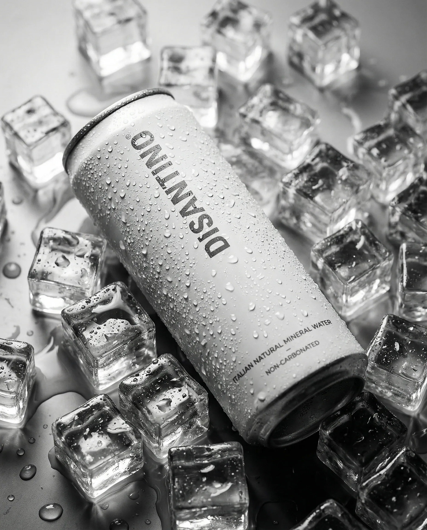
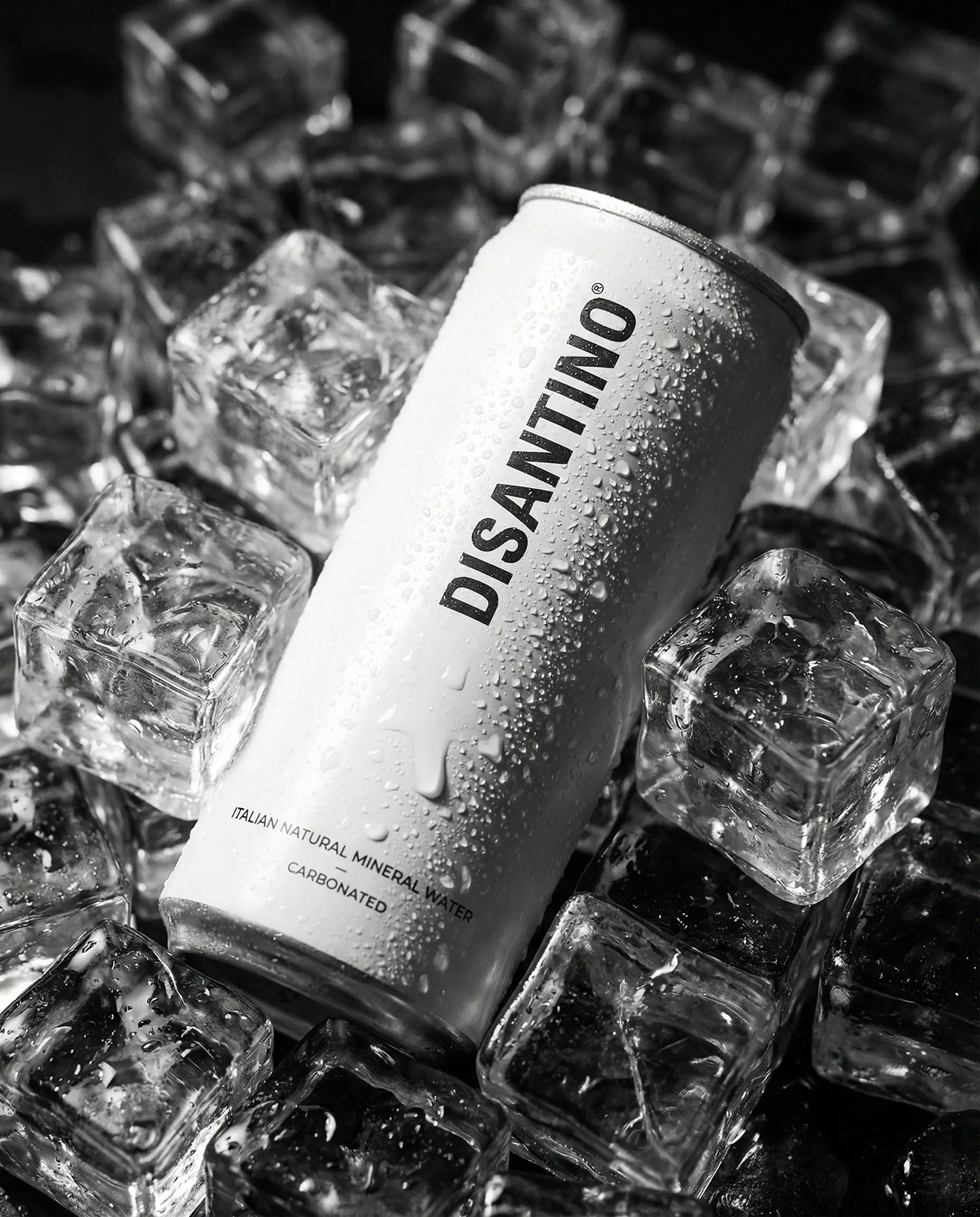
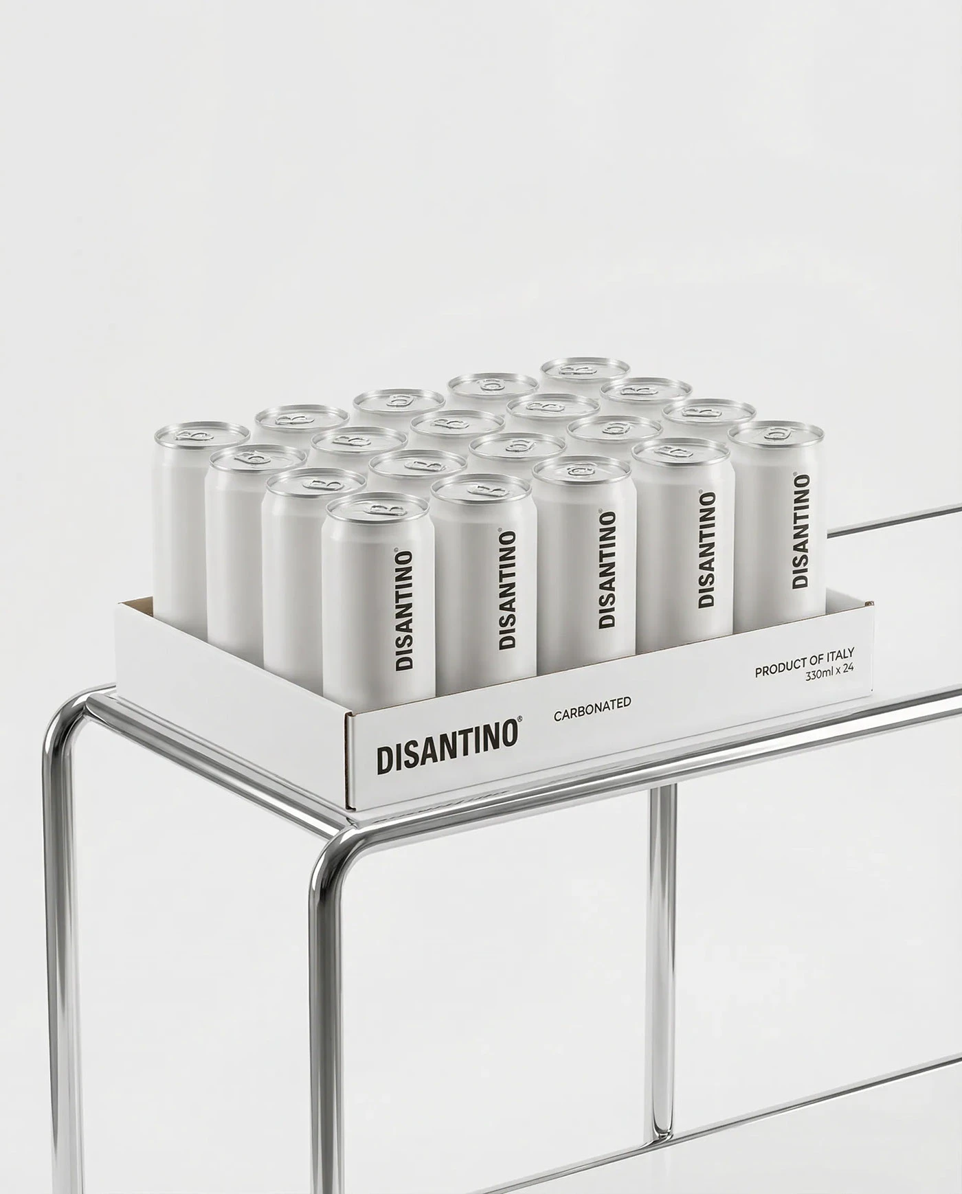
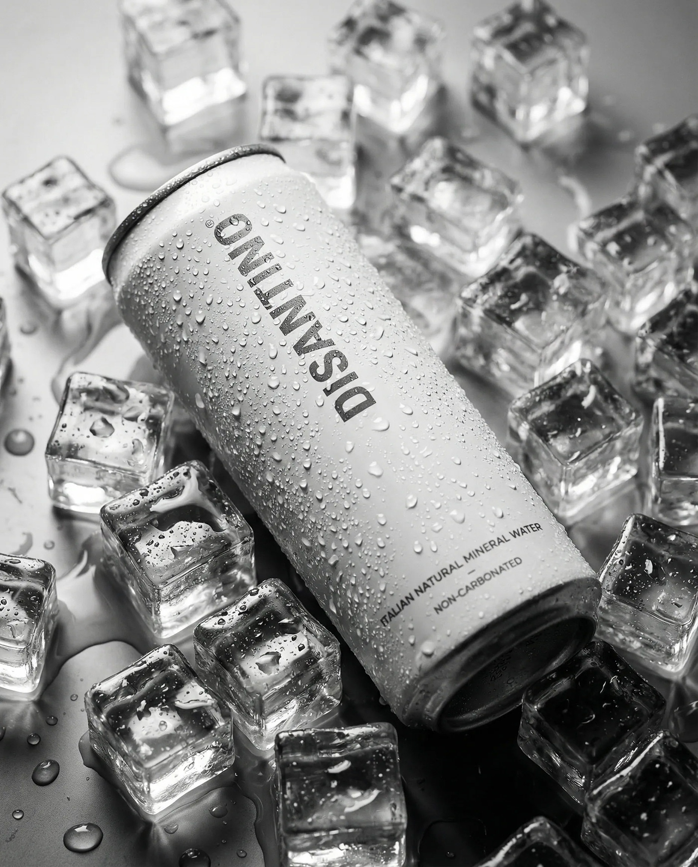
The design system centers on purity, coldness, and order. K9 Design Studio translates the clarity of natural mineral water into a clean visual language. This branding layout uses generous white space and a silver-white palette. The choice of neutral tones allows the product to stand out. Unnecessary details are removed to let the brand mark dominate. Black wordmarks provide strong contrast against metallic surfaces. A vertical logo placement on the aluminum cans is a clear decision. It ensures high recognition when the product is displayed, chilled, or held. Every element has a purpose, creating a sense of quiet luxury.
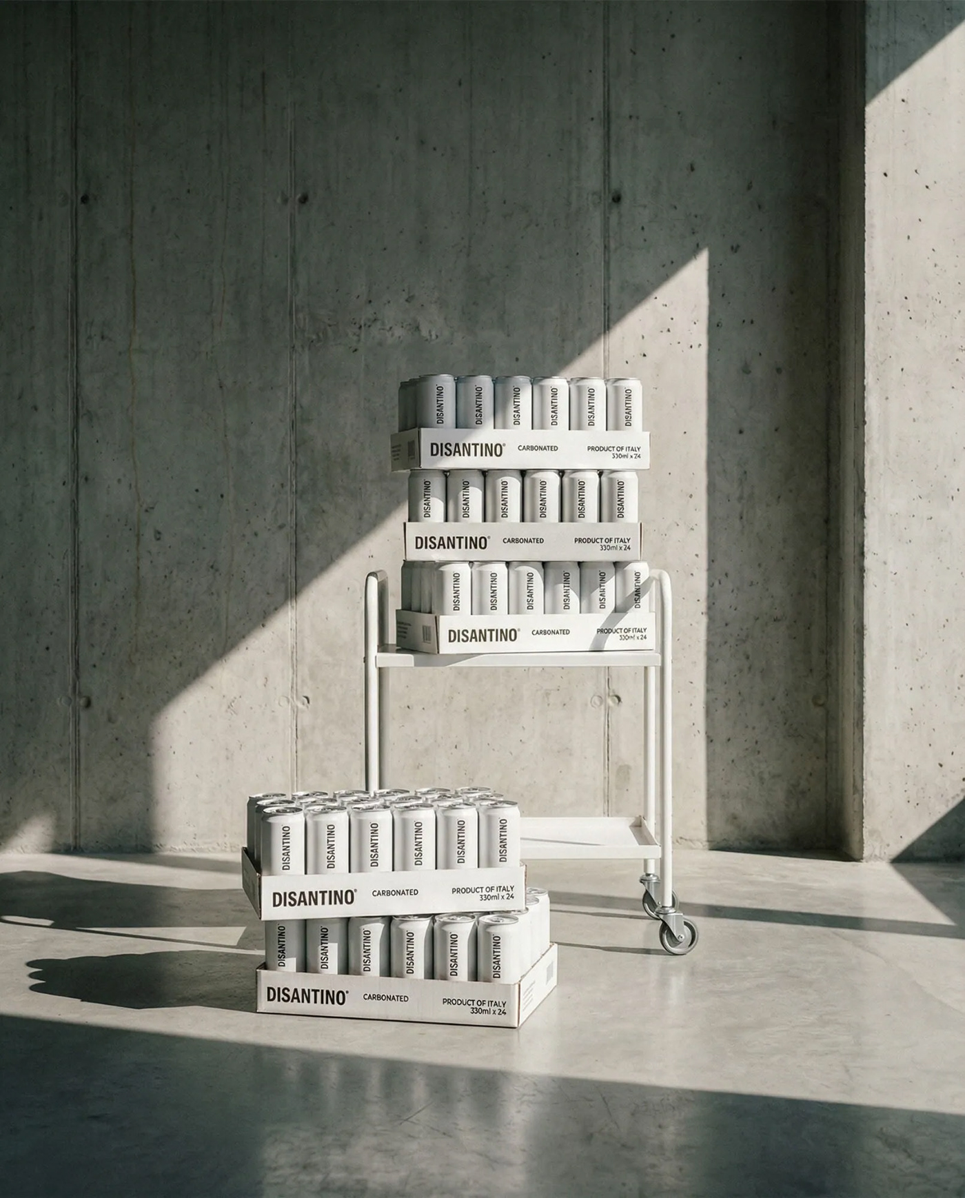
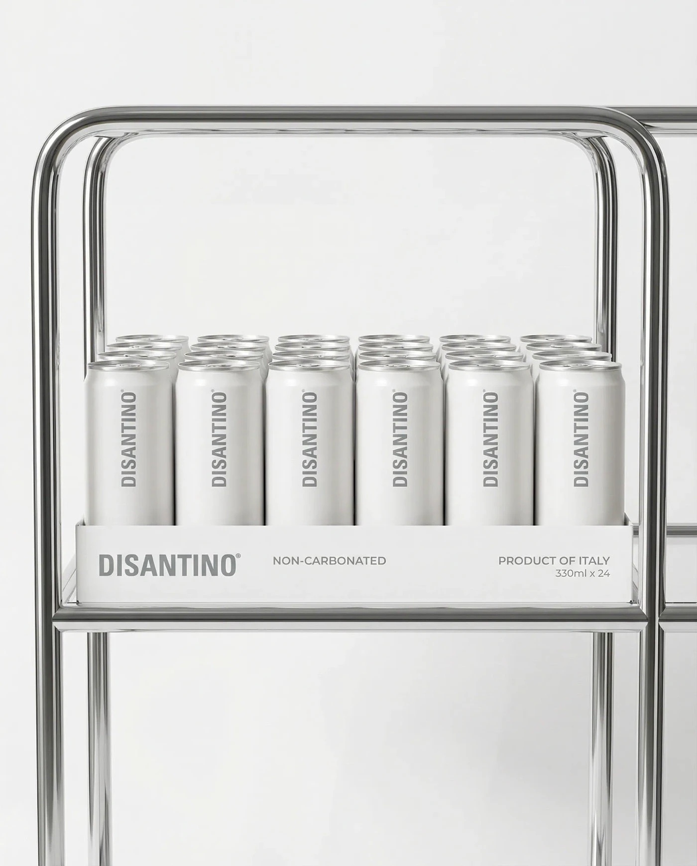
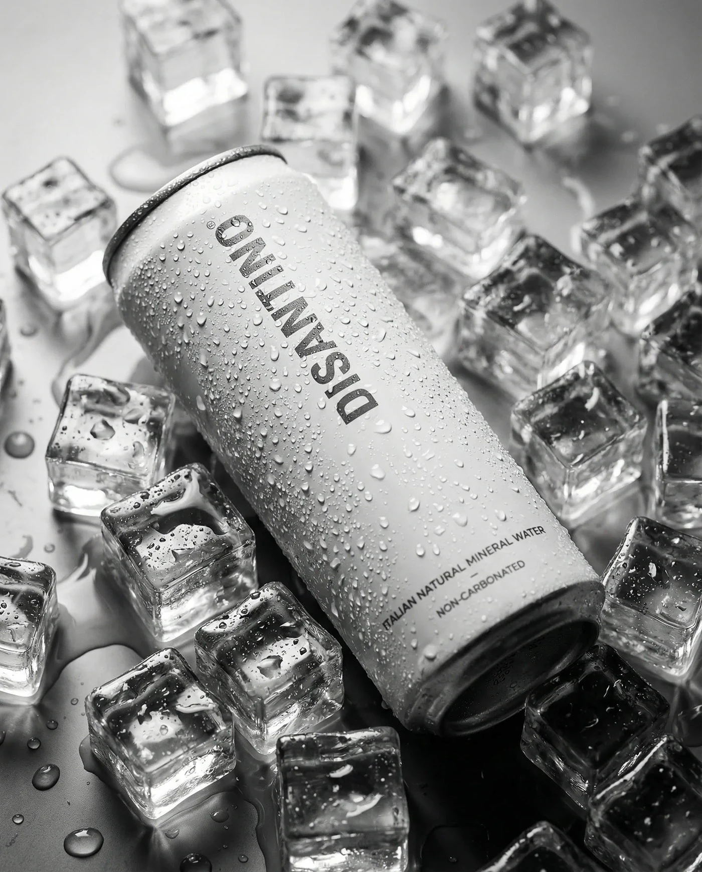
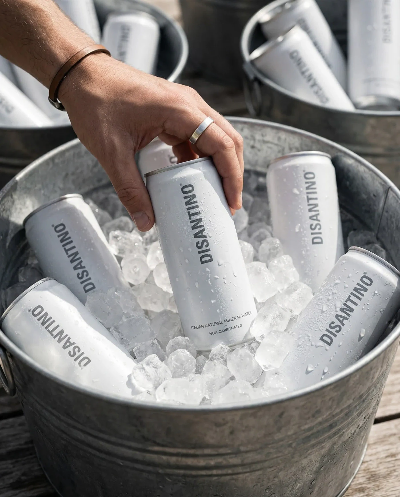
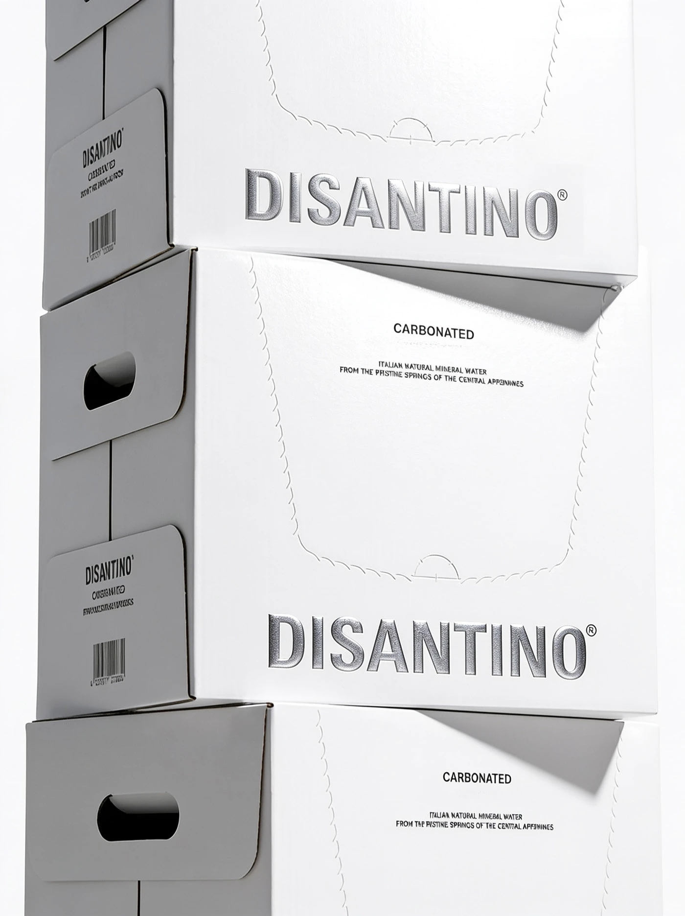
The design choices look beyond the single container. Kevin and the team design a complete system for retail display and photography. The packaging behaves as a block, stacking to form structural graphics. The outer carton features neat lines and embossed details in silver. This tactile finish feels premium to the touch. Whether placed in an ice bucket or on a trolley, the proportions remain balanced. Digital branding matches this physical presence. The clean photography highlights the metallic sheen of the cans. Each shot communicates the calm, pure character of the Italian water.
The identity succeeds because it balances simple forms with structural rules. By focusing on typography, the studio builds a consistent branding language. This work shows how restrained color choices make a product memorable. It creates a solid look for the beverage market. The studio proves that simplicity often says the most. This layout style creates a calm impression. The clean visual language elevates the simple product to a luxury level. See more work from the creators on K9 Design Studio.