Remember me
Meteoric launches a futuristic B2B energy identity with strategic branding, combining orbital graphic loops designed by How&How.
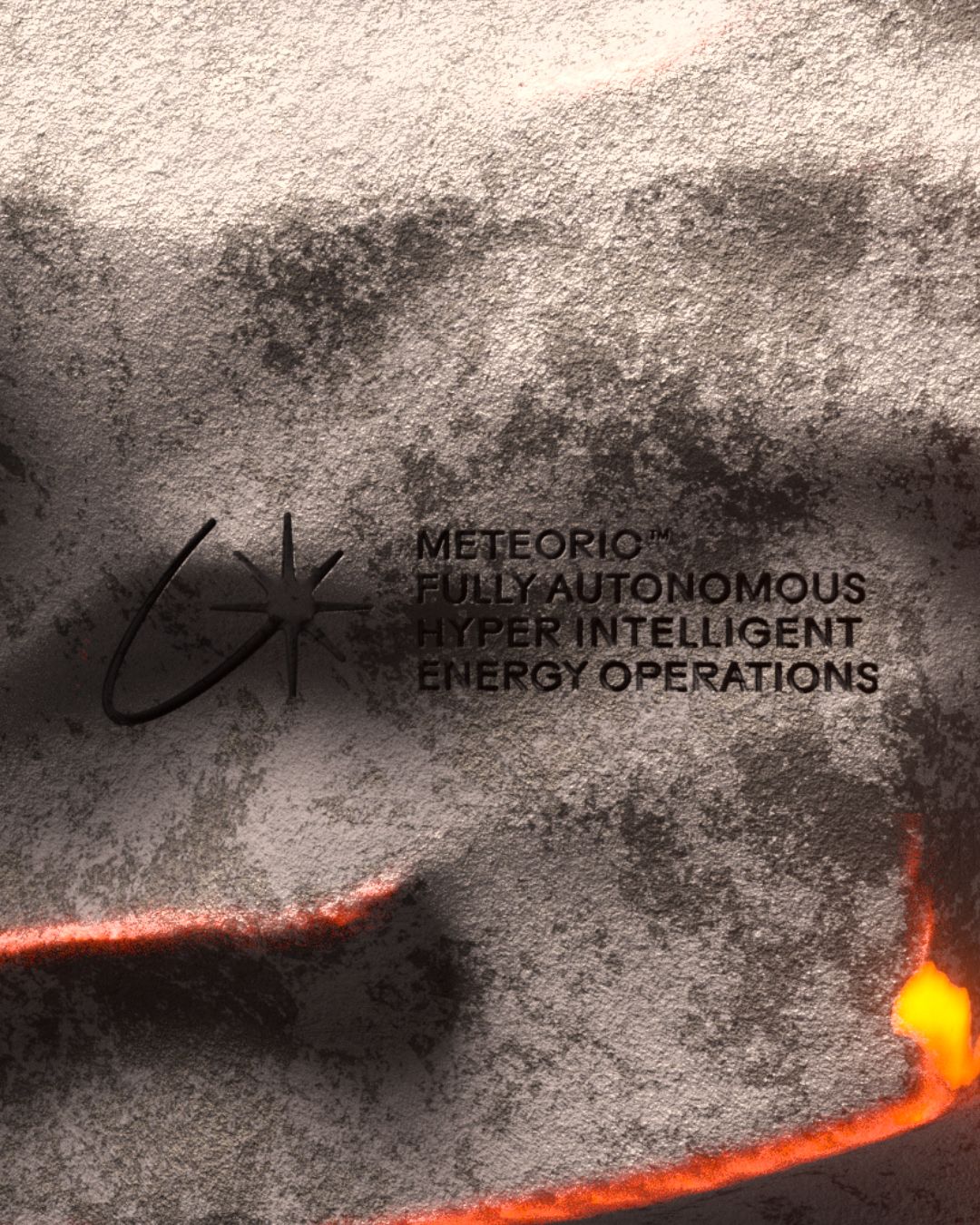
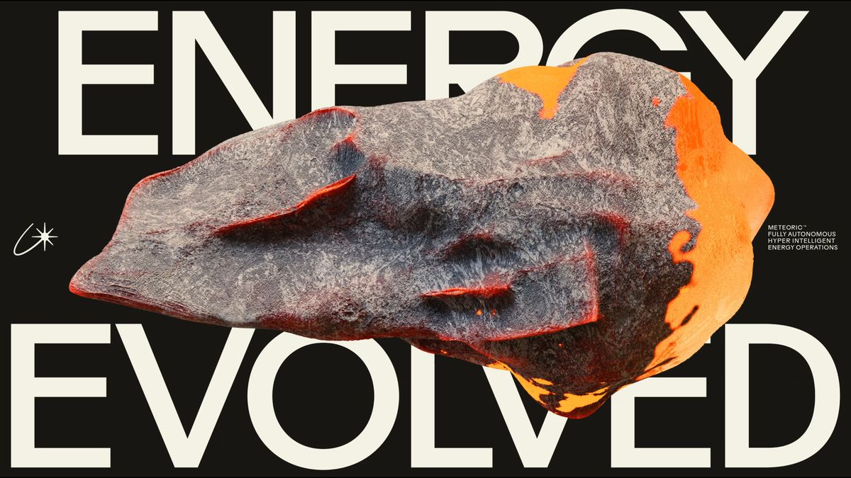
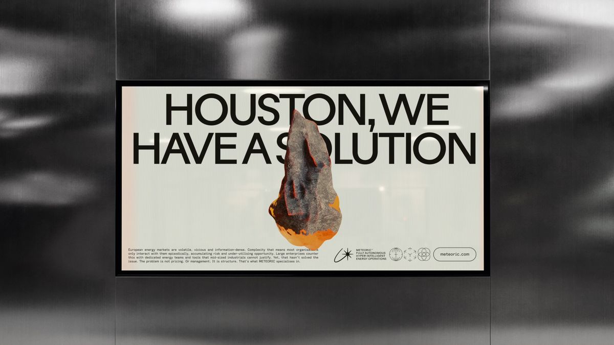
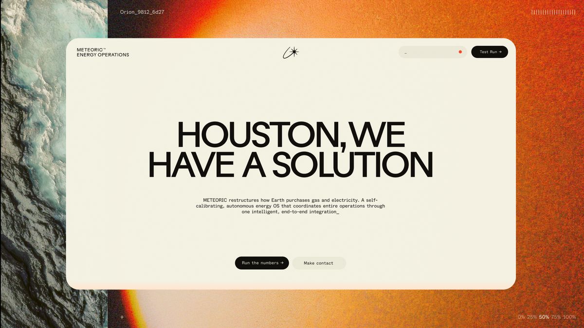
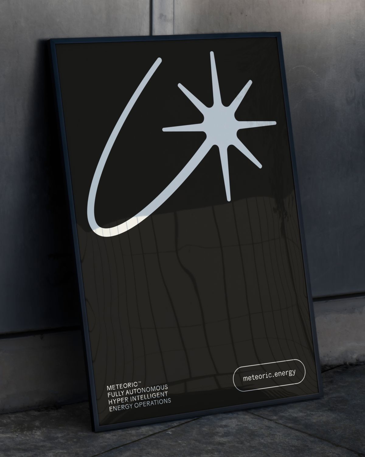
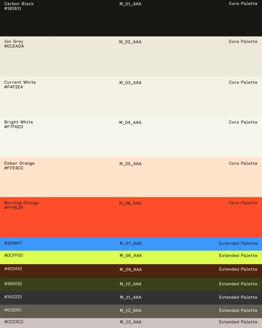
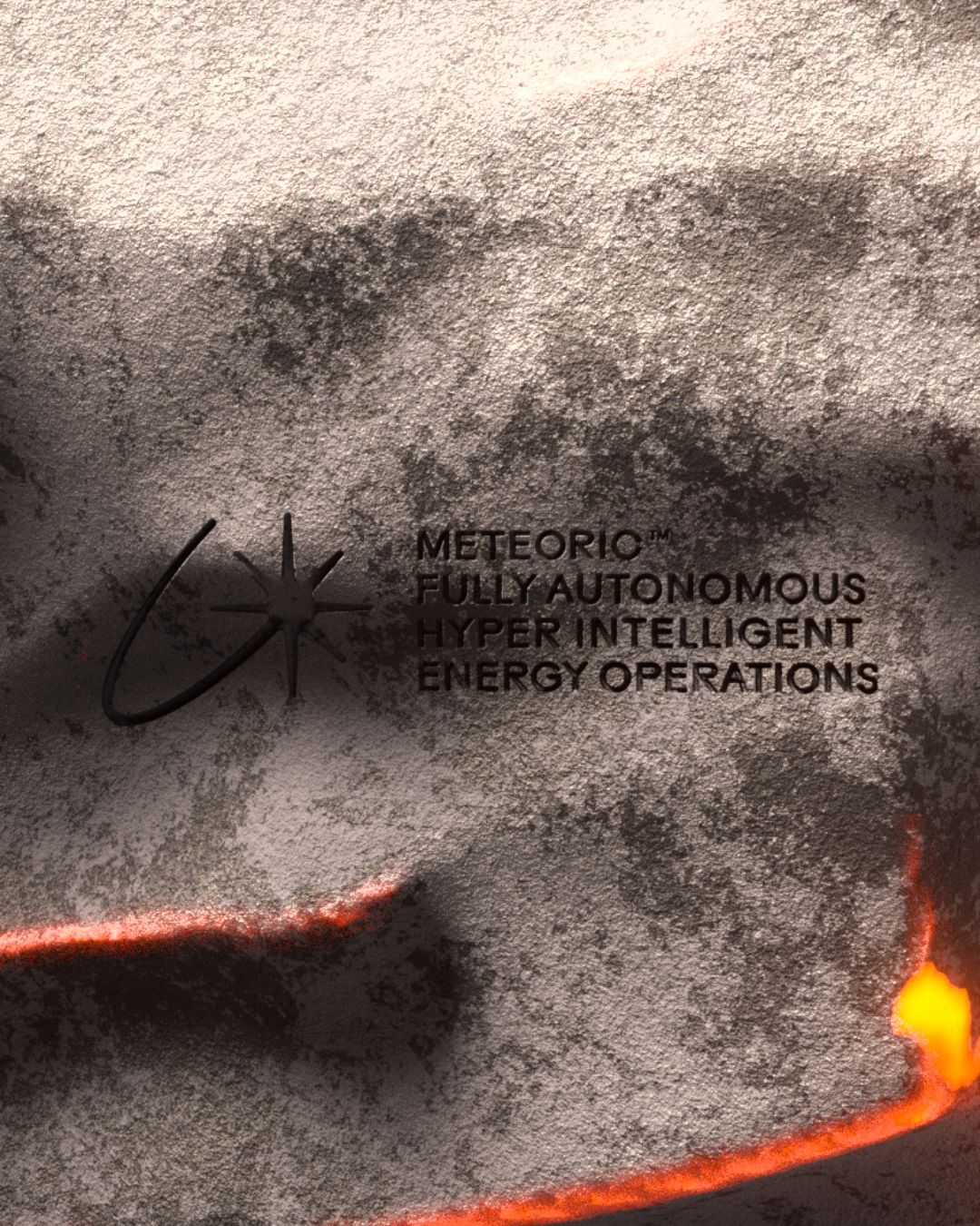
Design agency How&How established a modular branding system that avoids typical green-energy clichés. The palette pairs absolute black with a sharp, glowing acid green accent, mirroring high-tech cosmic fields. The primary logomark features a looping orbit line that resolves into a precise, eight-point star. This vector symbol is subtly debossed into rocky meteor-like surfaces in the campaign assets. The primary typography balances Mabry Pro's clean curves with GT Pressura's technical monospaced letters. This custom typographic layout choice establishes a clear contrast between organic human expression and technical digital precision across all digital screens.
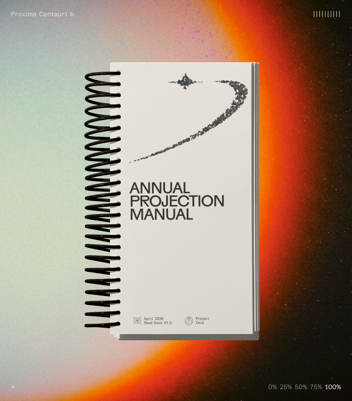
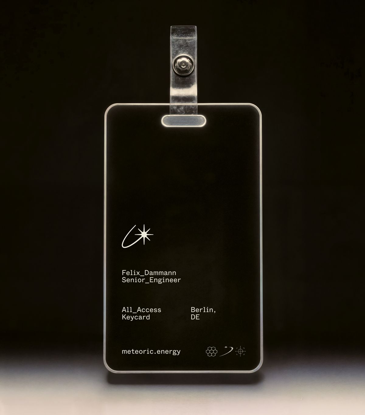
This branding system extends into physical touchpoints through minimal printed collateral and stippled icon sheets. The design uses matte black paper stocks, heavy debossed elements, and clean screen-printed details. The stark contrast between rough stippled icons and precise vector lines is inspiring. It highlights how digital energy flows can be successfully represented physically without any complex decoration. The corporate stationery and keycards prioritize generous whitespace and clean grid structures. This layout direction ensures that the physical assets feel as technical as the digital dashboard interface.
Ultimately, the branding simplifies how businesses interact with AI-powered energy solutions. The creative design team successfully created a layout that feels highly professional and contemporary. The clean grid system ensures that complex portfolio metrics remain legible at a glance. This structural choice makes the platform highly functional for busy industrial users. This project demonstrates how strategic design can modernize utility identities. For more details on the visual identity, visit How&How's project page. The system brings complex energy concepts to life.