
Remember me

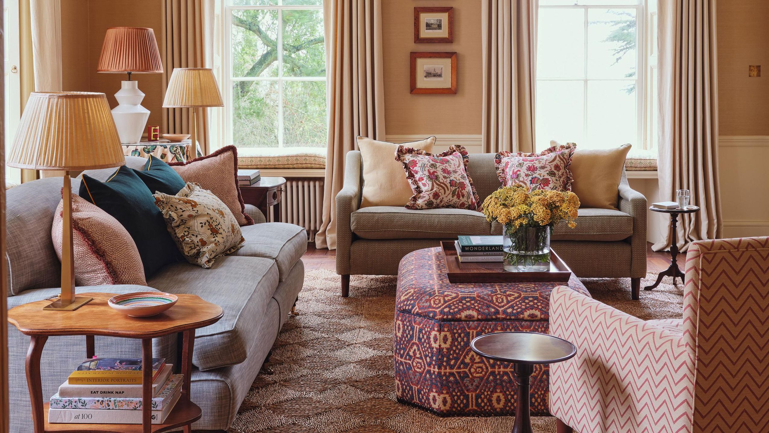
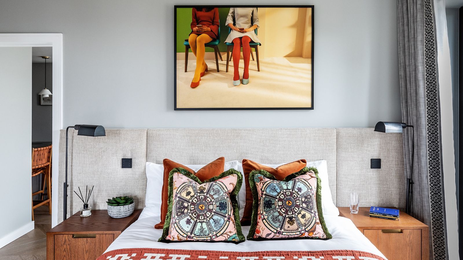
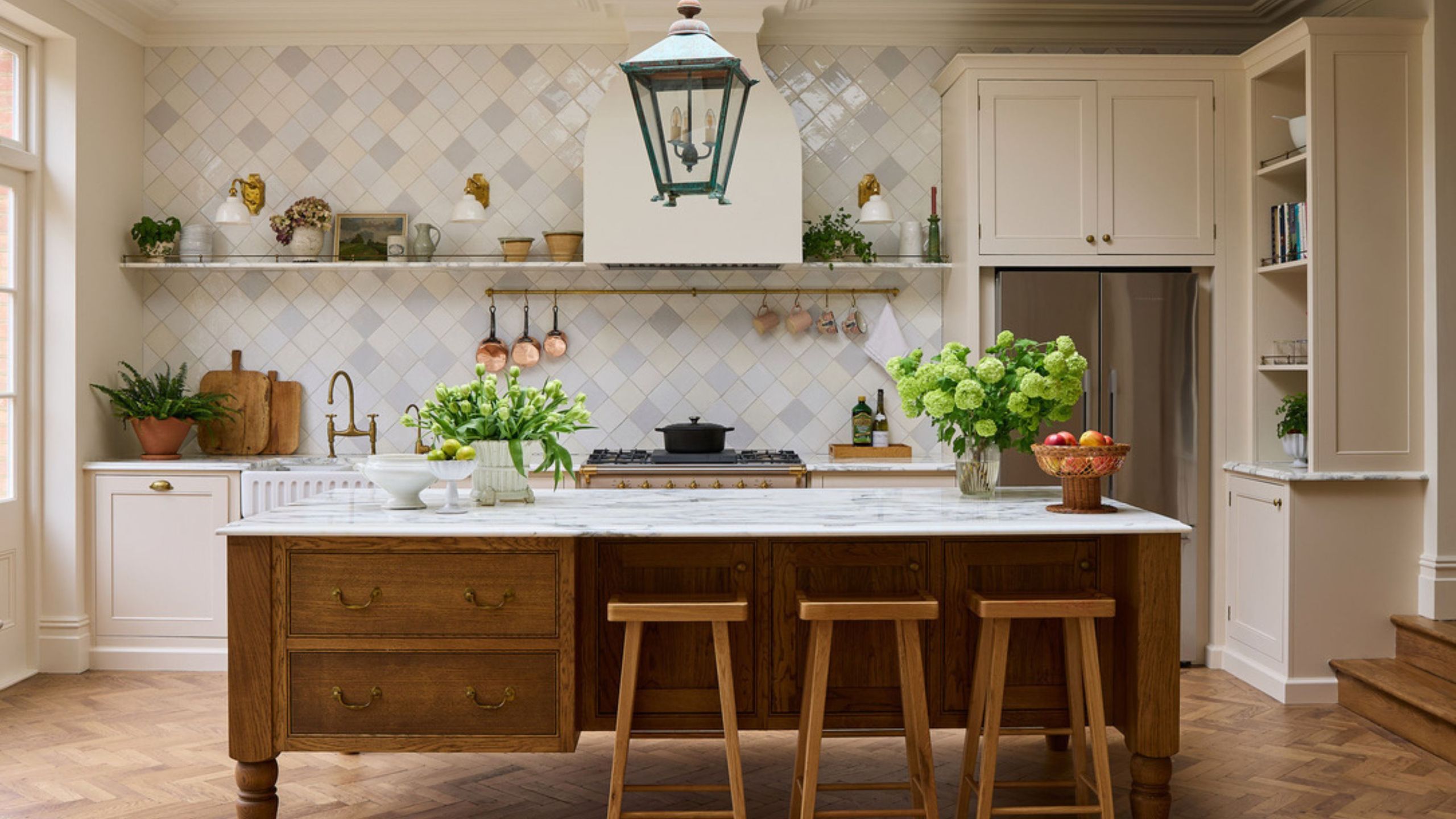
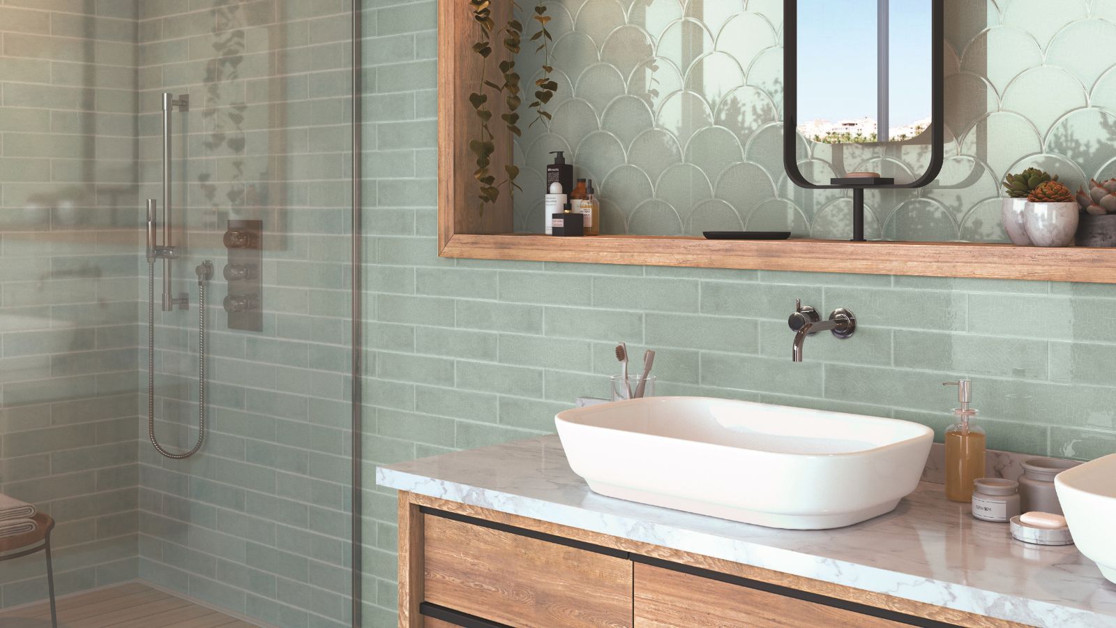
Those who approach decorating with color with a slight caution will know all about the power of muted pastels. Not so neutral that you hardly notice them, but subtle enough to gently cocoon rather than dominate, sun-faded pastels are the answer to schemes in need of a little quiet but not silence.
While pastel rooms have gained a reputation for erring into juvenile territory (think lemon yellows, candyfloss pinks, and sky blues), sun-faded pastels are the chicer, far more enduring color trend, still offering delicious color but in a more muted dose.
'Sun-faded pastels are pastels that have lived a little,' says designer Amy McCoy of McCoy Design Studio. 'The colors feel like they've been softened by years of afternoon light rather than mixed straight from a paint chip. Think a blue that reads more "worn chambray" than "baby blue," a green that feels like sea glass rather than mint. They have warmth and depth to them, and as the trend leans toward color, I think sun-faded pastels are a great way to dip your toe into color without fully committing.'
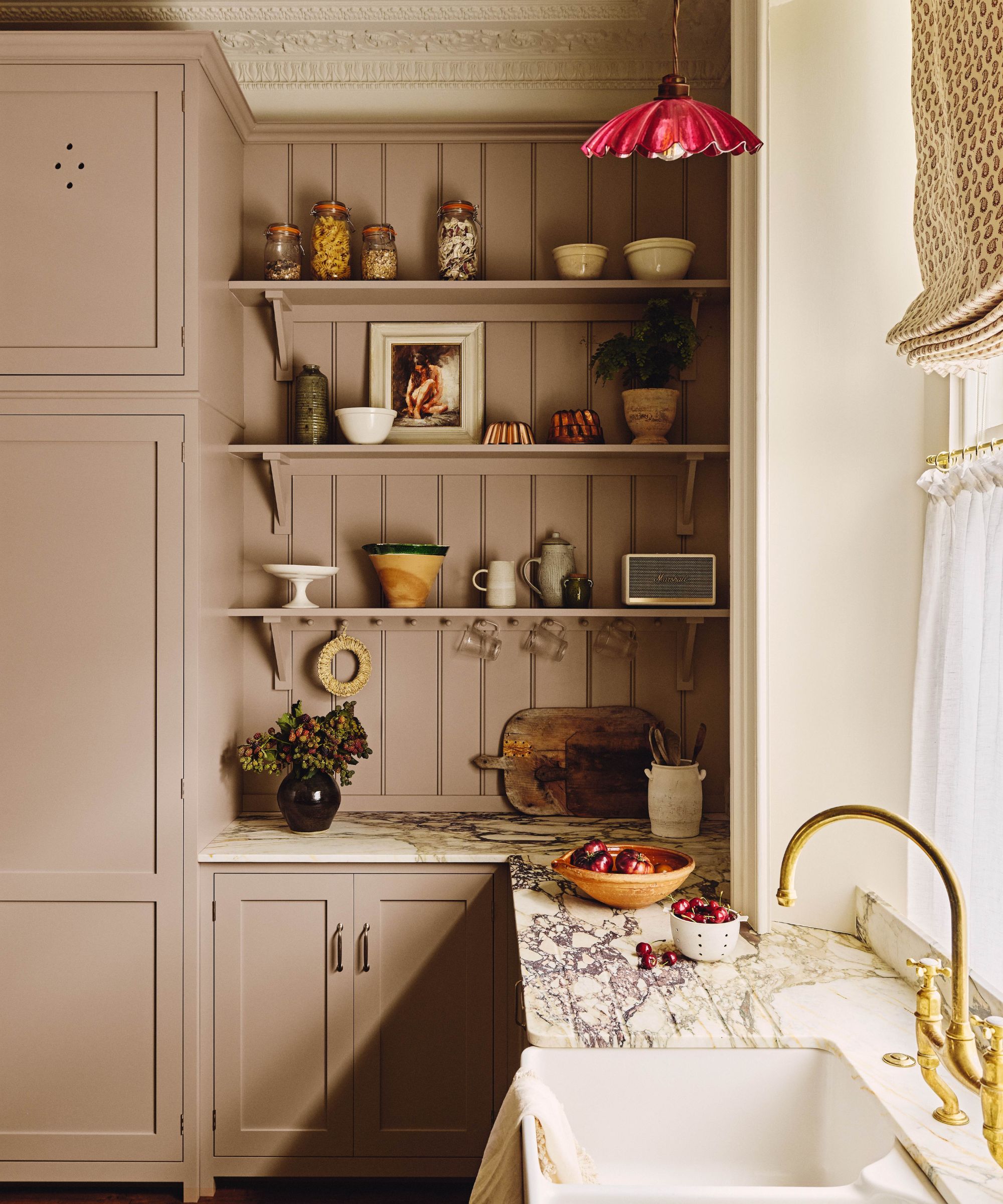
A dusky pink paint brings muted warmth to this bright and airy kitchen.
(Image credit: Photography: Kensington Leverne Styling: Anna Sheridon)
Laura Hammett, creative director of the eponymous design studio, knows a thing or two about decorating with a muted color scheme. 'When developing our Laura Hammett Living Paint Collection, I was inspired by the enduring beauty of traditional interiors and the calming effect of nature. The palette spans warm neutrals, gentle blushes, and earthy greens – all chosen to layer effortlessly in both period and contemporary homes.'
'Heritage-inspired colors like blush pink, sage, soft olive, and warm linen offer an instant sense of refinement,' says Laura. 'They’re timeless and elegant, adding subtle character without ever feeling overdone.'
You may like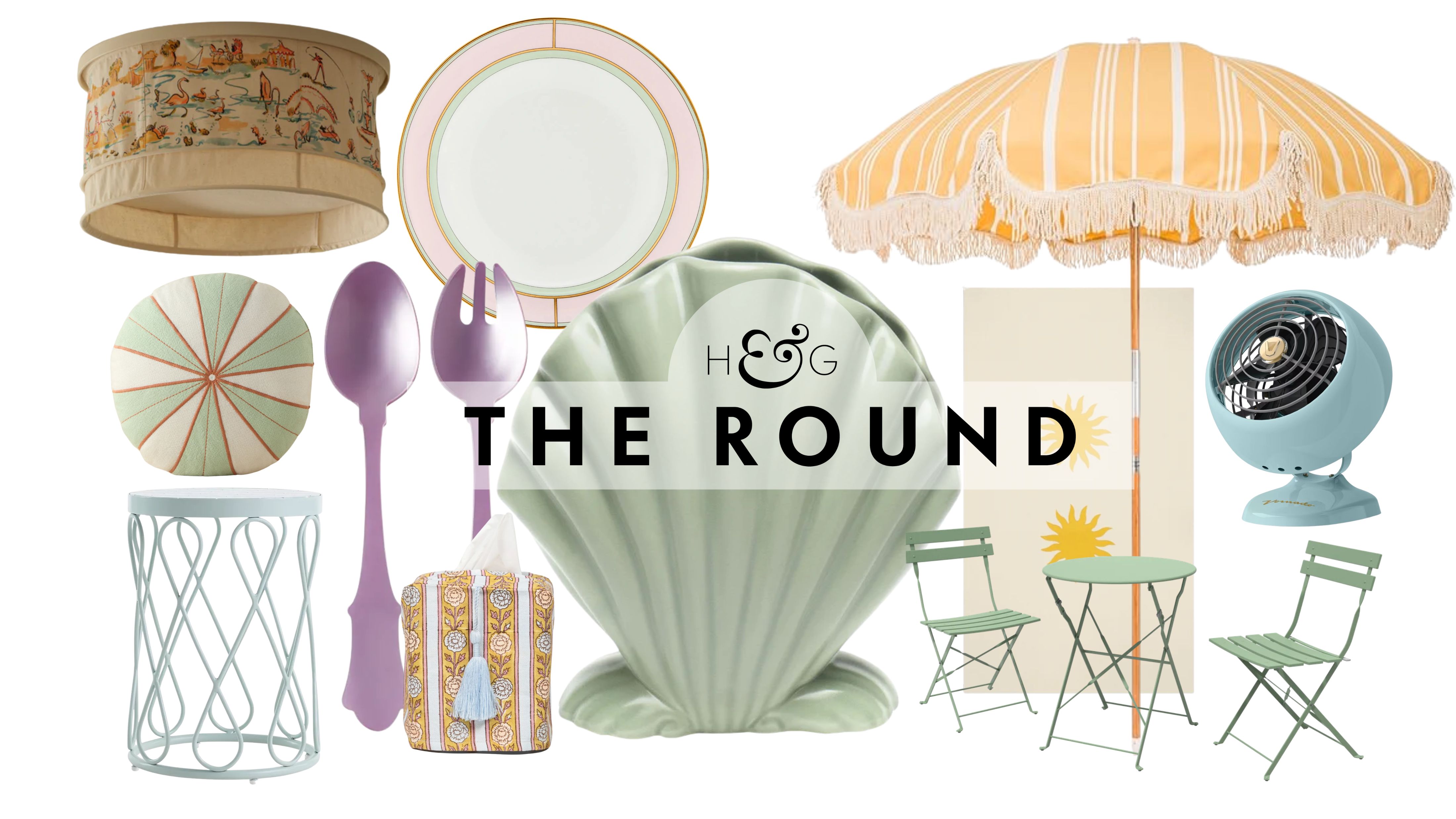 This Summer, Designers Are Swapping Bright Colors for Softer, More Elegant Shades – These 16 Finds Make It Easy to Shop the Trend
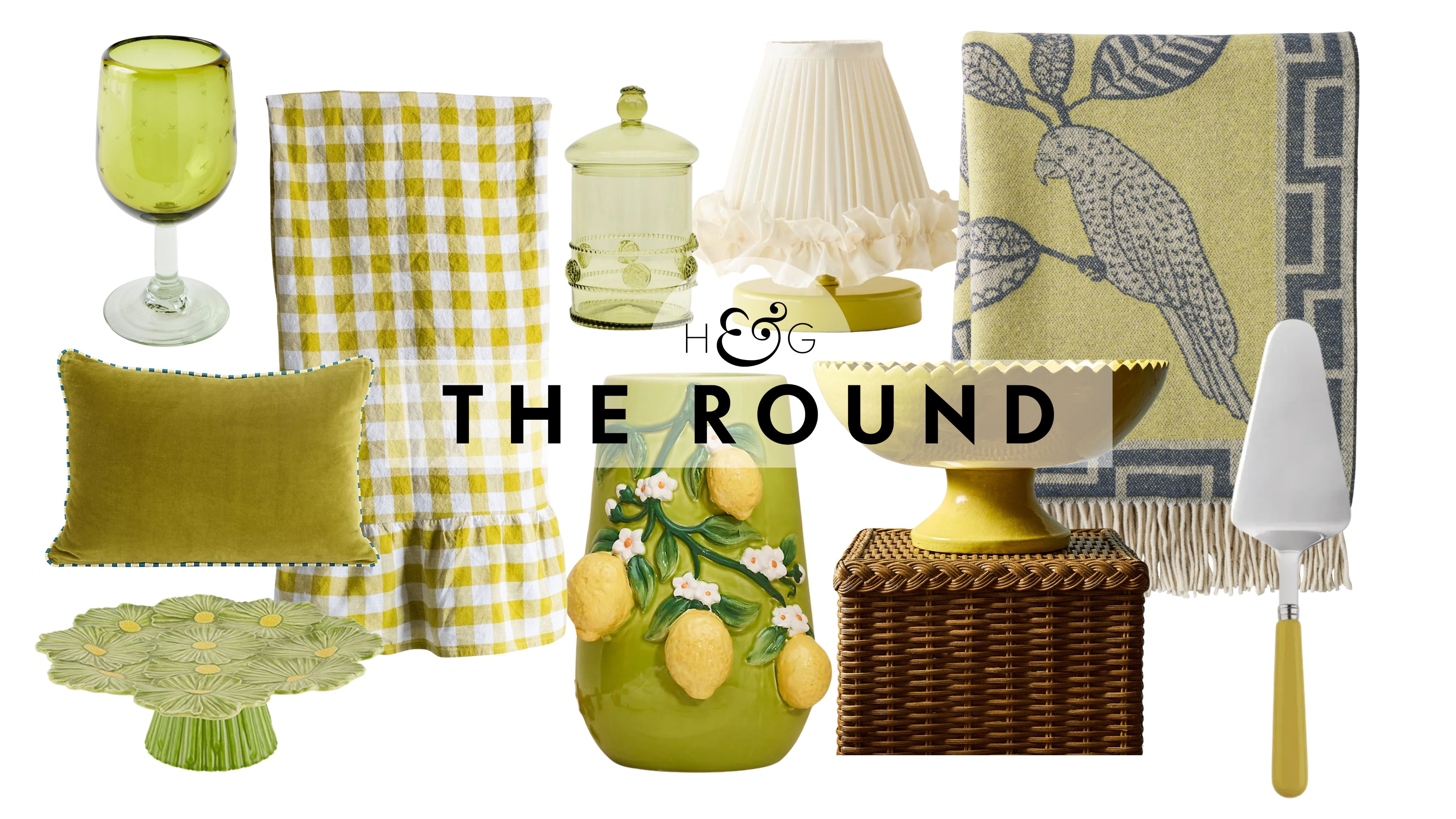 This Zingy Green is Replacing Chartreuse This Summer – Shop 16 Finds in the Season's Most Surprising Color Trend
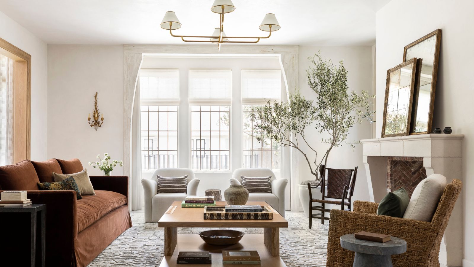 'The Look Became Predictable' – These Are the Color Palettes Designers Are Using to Replace Farmhouse White
'These tones often echo the materials and patinas found in historic buildings – from the soft smoke hues of aged stone to the warmth of sun-faded plaster. Our Mulberry shade, for example, takes its cue from the deep, rich berry tones often seen in old English estates, adding drama and richness to schemes.'
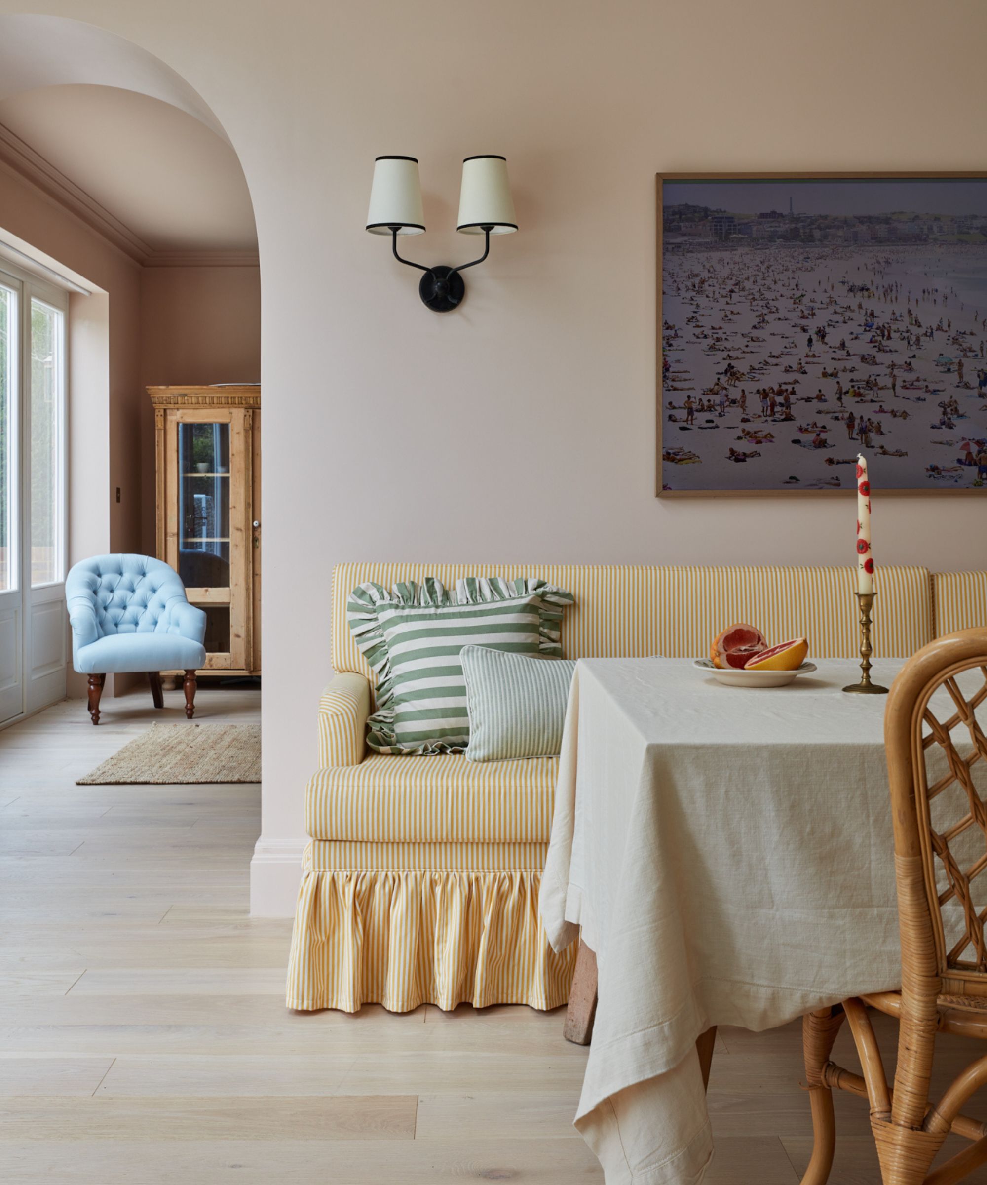
A plaster pink paint brings a tranquil feel to this dining room, matched by the pale yellow sofa and organic materials.
(Image credit: Vaughan Design & Development / Photography Chris Snook)
'Sun-washed tones feel especially relevant right now when they’re paired with unexpected, slightly softened color combinations rather than strict palettes,' say Mike Shively and Lucas Goldbach of En Masse Architecture and Design. 'Homeowners are gravitating toward interiors that feel comfortable, safe, and lived-in, and using these pared-down tones in unexpected ways helps achieve that while still keeping a sense of uniqueness.'
'Mauve with sage green works beautifully in bedrooms or softer living spaces where you want calm but still a sense of dimension,' add Mike and Lucas. 'Mustard with blue-green tones is another combination we use often in living rooms for contrast that still feels easy.'
There's a steer away from cool-toned cooking spaces in favor of muted pastel kitchens. 'We’re using butter yellows that sit in that middle ground – stronger than a soft pastel but not overly saturated. There’s a real appetite for yellow kitchens right now, and we’ve done one recently and are working on another.'
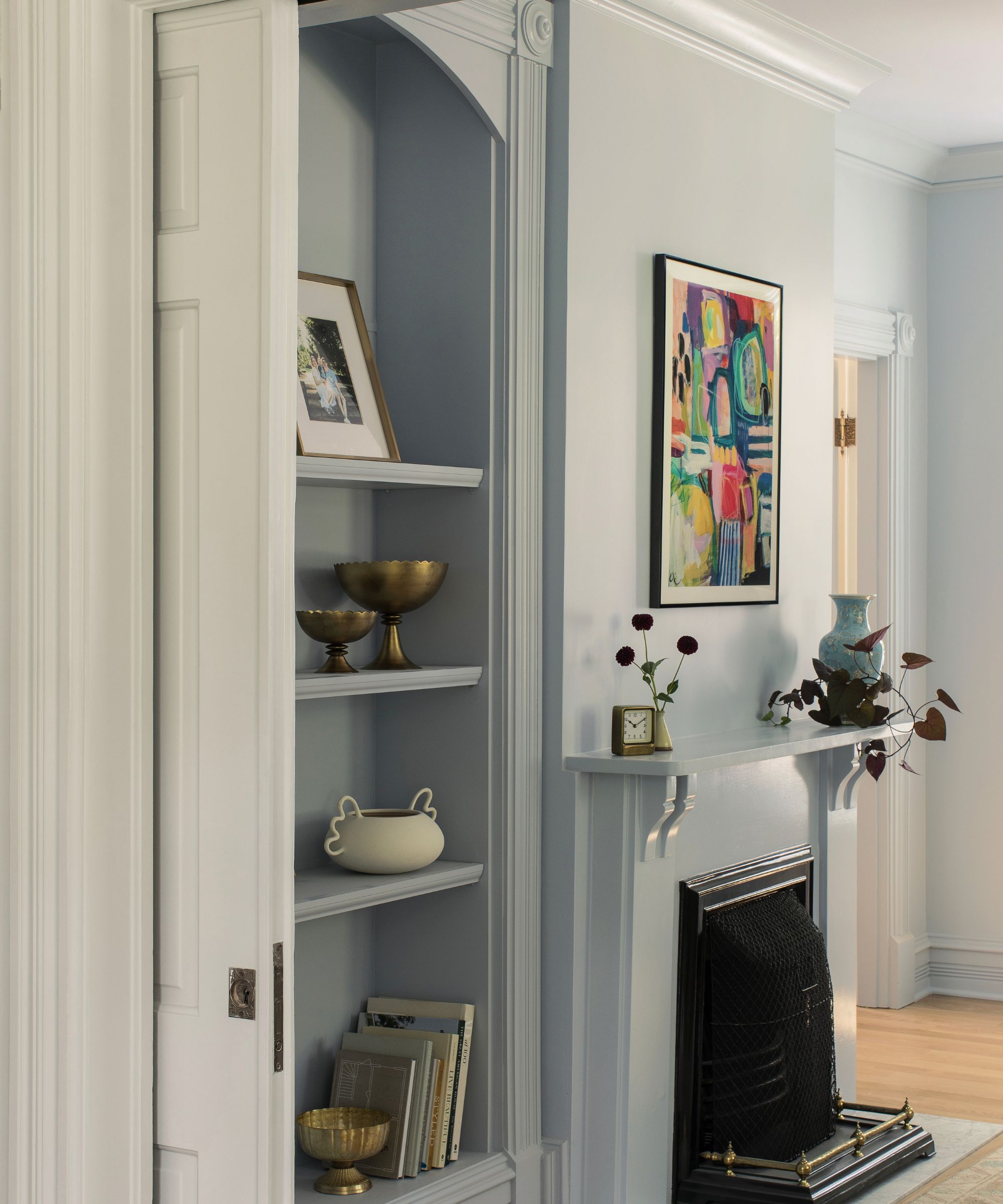
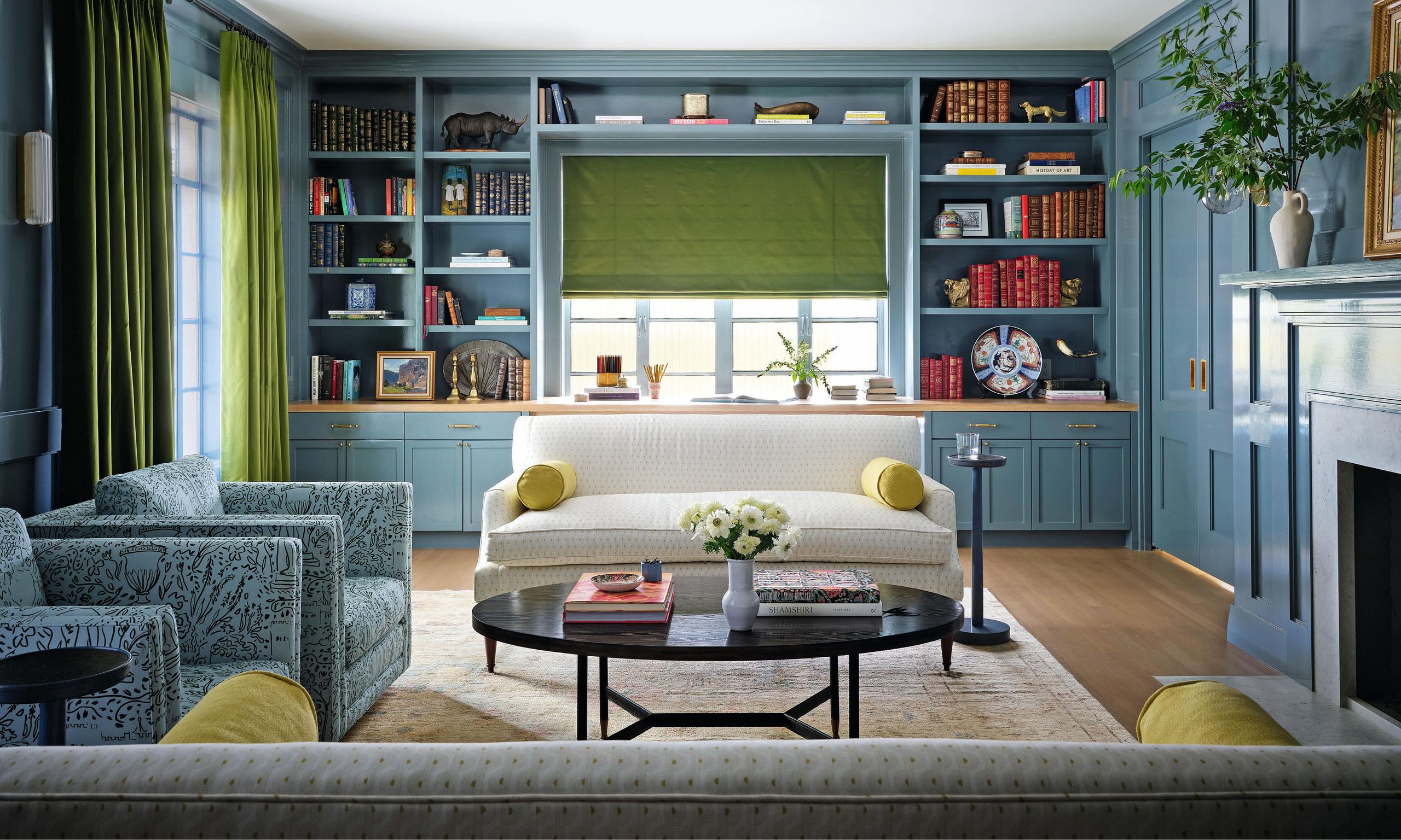
Drenched in a pale blue paint, this living room strikes a balance between calming and characterful.
(Image credit: McCoy Design Studio)
'Color trends are gently shifting. While bold, highly saturated hues were popular in the early 2020s, these are now giving way to more nuanced and versatile shades,' says Helen Shaw, director of marketing at Benjamin Moore. 'Similarly, traditional grays and beiges are evolving as designers and homeowners explore warmer, more layered alternatives. Rather than fleeting microtrends, the focus is now on colors that offer lasting appeal and flexibility over time.'
What to read next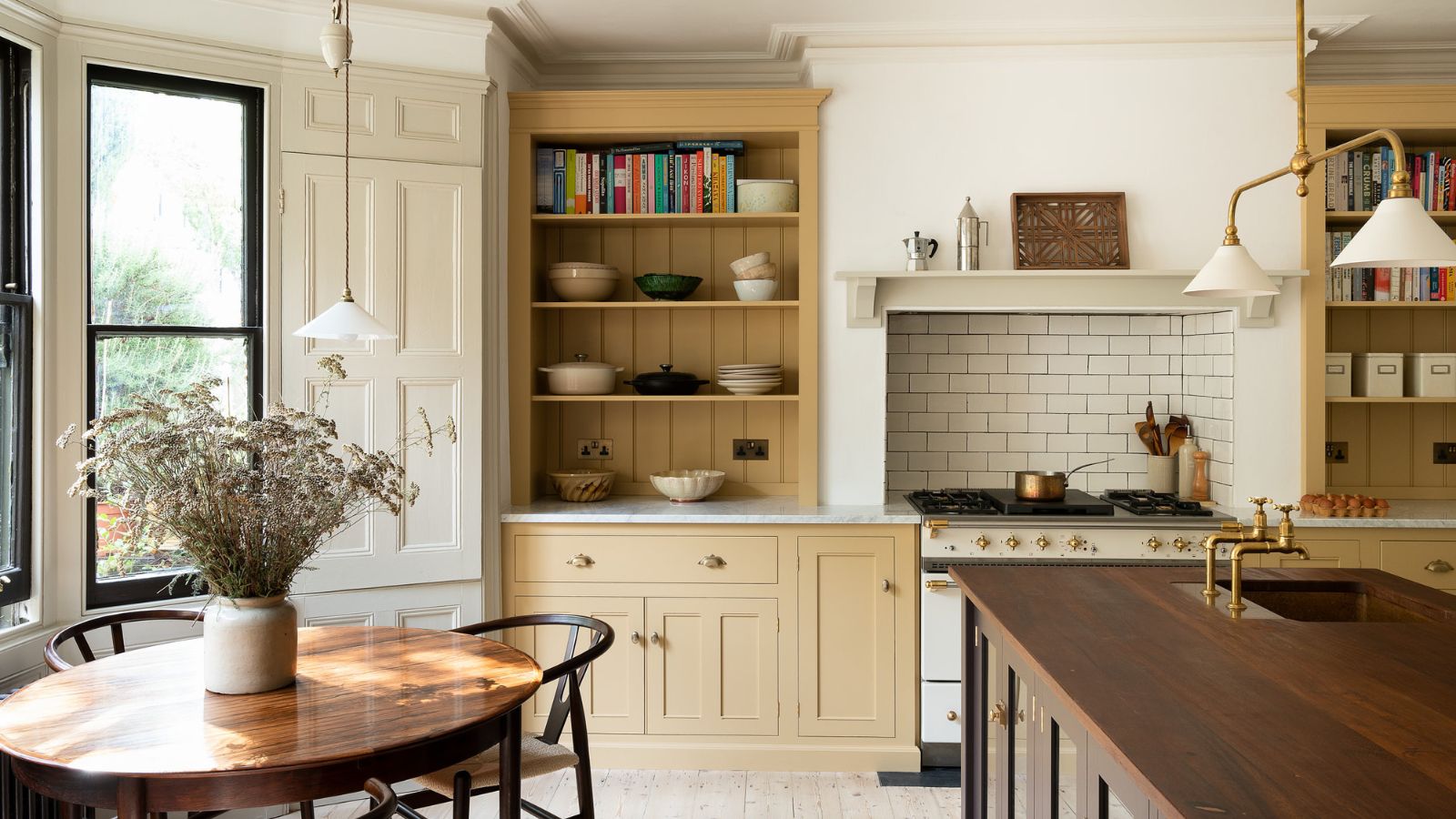 This Unexpected Shade Is Replacing Pale Greens in Designer Homes – And It Feels So Much More Luxurious
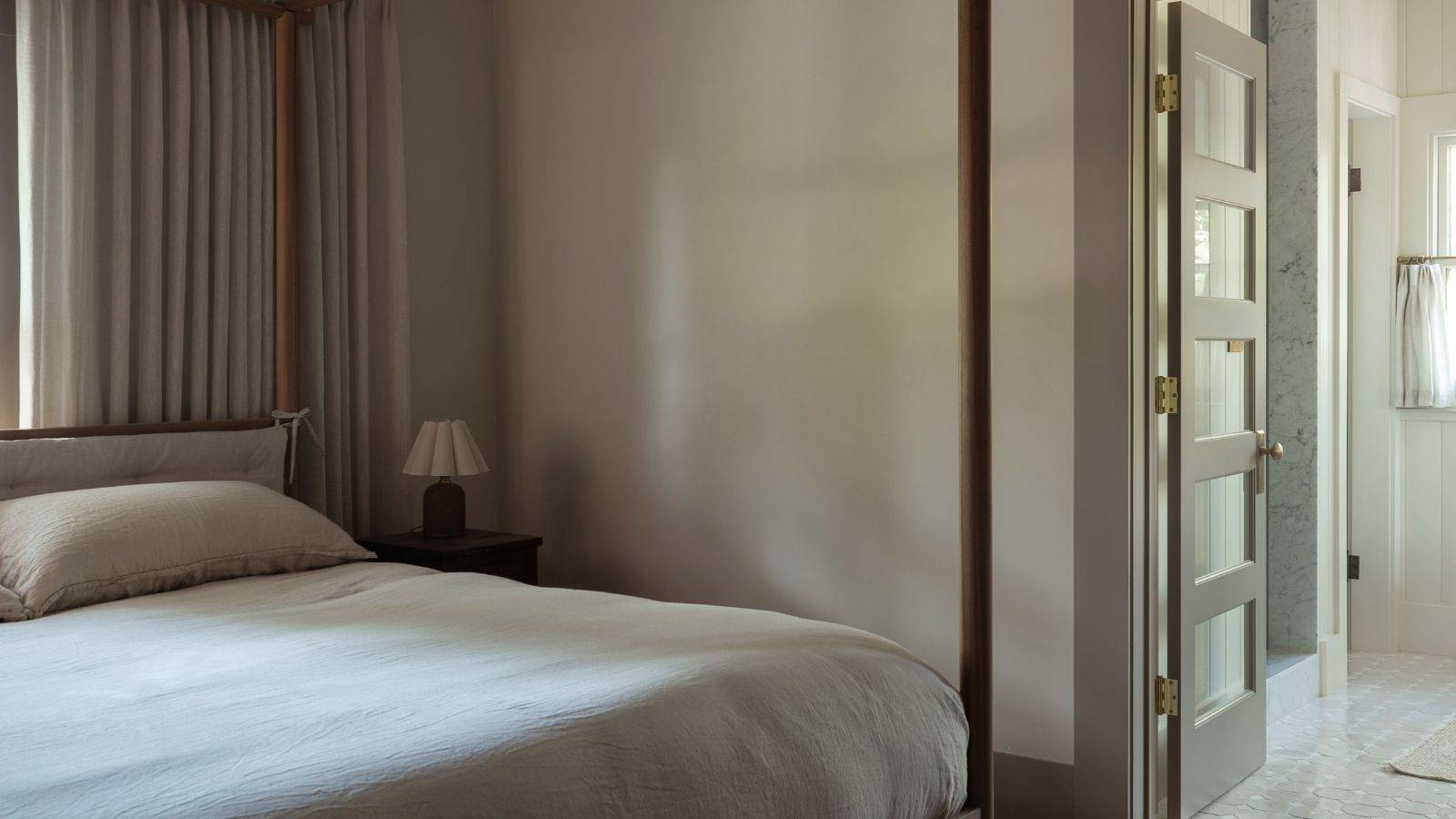 What Are Chromatic Neutrals? The Elevated Color Trend Designers Say Is Replacing Boring Schemes
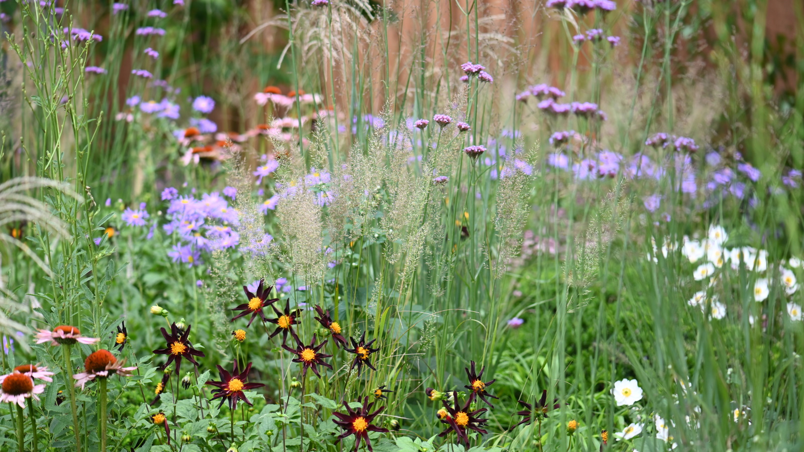 Designers Are Ditching All-White Gardens – These Gentler Color Palettes Are Replacing Them for Summer 2026
'This new direction embraces ‘quietly colorful’ tones – subtle, comforting hues that feel fresh yet timeless,' Helen continues. 'Neutrals are no longer limited to flat, background shades, but instead encompass quietly confident colors with subtle undertones that feel richer and more intentional while still remaining versatile.'
'This shift towards warmer, more nuanced palettes has created the perfect environment for sun-faded pastels to come to the forefront. Shades such as dusty rose, butter yellow, and sage green offer the softness of a neutral while introducing warmth and personality and can now stand on their own as primary design elements, often forming the foundation of entire palettes.'
'Sun-faded pastels offer the versatility of classic neutrals, but with far more depth and personality,' explains Helen. 'Unlike cool-toned whites, which can sometimes feel stark or clinical, these layered shades introduce subtle color and warmth while maintaining a calm and adaptable backdrop.'
Love beautiful design ideas, expert advice, and inspiring decor trends? Sign up for our newsletter and get the latest features delivered straight to your inbox.