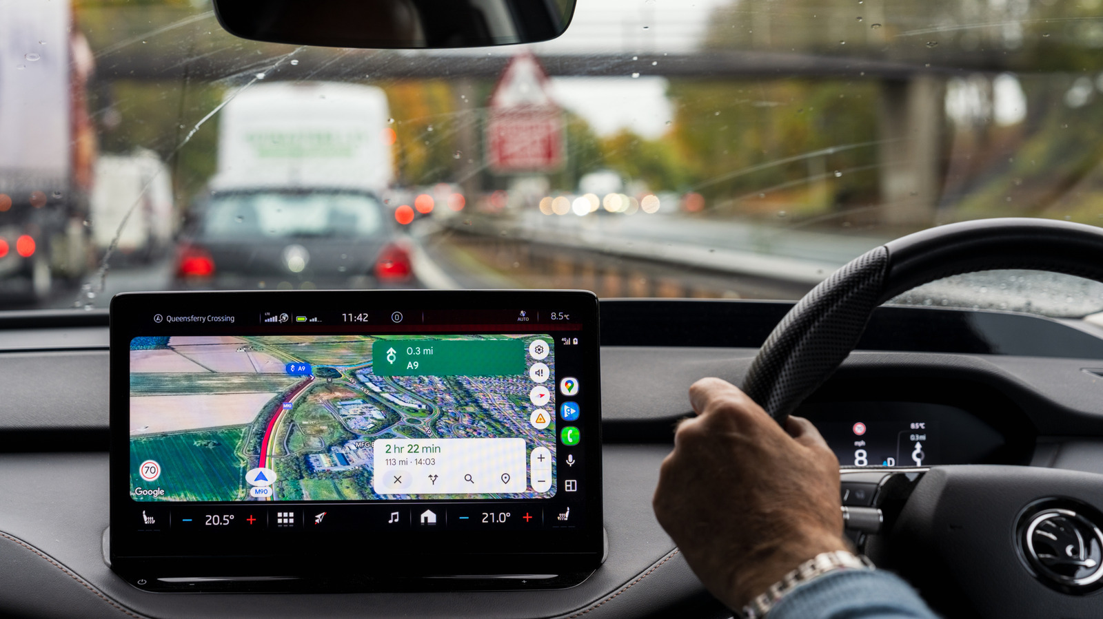
Navigation apps like Google Maps and Waze utilize visual indicators to keep you informed as you drive, walk, or travel. For example, you might see different colored roads to indicate the type of road, such as highways versus regular streets, red dotted lines to help outline obstructions, and various icons and symbols, like the leaf symbol that shows up from time to time, depending on your chosen route. One such indicator is the actual color of the ETA time when you have a navigation session active. Anytime you ask for directions, you'll see an estimated time of arrival, which usually updates in real time based on traffic and other potential delays. But those digits will change color over time, which may seem a bit confusing at first.
The reason is that the color helps to highlight traffic and travel conditions along your route. The color scheme is pretty simple, too. Green means smooth sailing, with no traffic or delays. Orange means minor traffic or events that could cause delays. Red means pretty much what you'd expect, heavy traffic or congestion with a high likelihood of stoppages due to construction or accidents. Ultimately, the colors give you another quick cue as to what's happening along your current route.
The ETA color change is not the only time that Google Maps makes intuitive use of these design principles. As previously mentioned, road colors change based on various conditions and indicators, as well. However, colored roads are totally different from some other lines that appear, like a blue line in Google Maps, which represents the various bodies of water, man-made or otherwise. Waze, by comparison, has a map editing mode where different road colors indicate road types.
But in Google Maps, there are a ton of different color variations, symbols, and meanings, all core parts of its design that you'll want to both recognize and pay attention to. They tend to follow the same concepts — green for good, yellow or orange for caution, and red for hazards or delays. Different shades of those colors are used to signify the degree of severity. For instance, standard red indicates heavy traffic or congestion, whereas dark red or maroon shows the most severe levels of traffic, where you can expect bumper-to-bumper or near-standstill traffic in these areas. The takeaway here is that those colors mean something, so when you see them in Google Maps, it's best to give them the consideration they deserve.