Do All Official U.S. Road Signs Use The Same Font And Design?
You don't have to have held an official job to know that Uncle Sam spends big money keeping things uniform — even road signs. Take a trip across the country, and you're sure to see three-pointed, shield-shaped signs representing interstates, route signs that resemble the badge on a cartoon cop, blue signs telling you about upcoming services, and green highway signs sending you just about everywhere else. As for the text on those signs, it's all familiar typeface guiding you through cities and across state lines. Or is it?
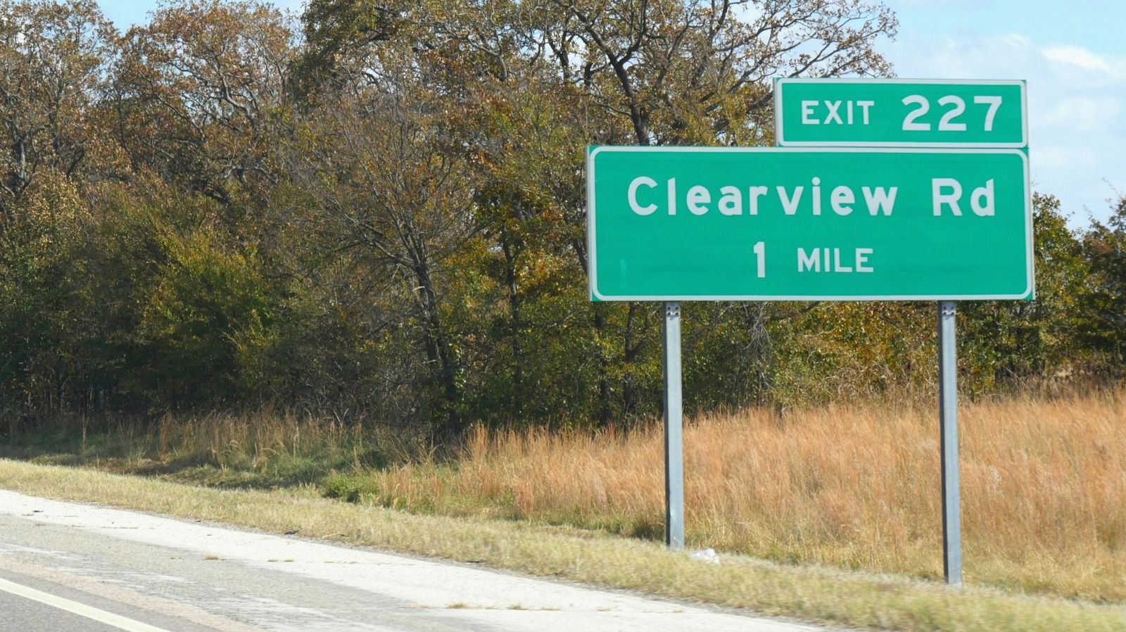
At its core, the choice of font on just about every highway sign in the country boils down to an ongoing debate over two primary typeface systems. In one corner, it's the time-honored Highway Gothic. In the other, it's the (arguably) improved Clearview. Look close enough, and you'll find some differences between the two as you head off, as Simon & Garfunkel sang, to look for America.
The choice of font came down to Highway Gothic versus Clearview
Before President Dwight D. Eisenhower signed the Federal-Aid Highway Act in 1956, drivers could still voyage across the United States on a network of roads, navigating via road signs just as you can today. Those signs, however, were an overhead and roadside mishmash of fonts, shapes, and colors. When 70-mph highway speeds were mostly science fiction, the chaotic signage was fine. Unsightly, sure. But legible enough for the drivers of the time at the speeds of the time.
As speeds increased, though, the Federal Highway Administration (FHWA) – the same organization that insisted states stop putting jokes in highway signage – had a way to clean things up. The agency reached into its bag of tricks and pulled out Highway Gothic, a modified version of the Gothic font you'd find in your font dropdown. So, from 1948 on, the FHWA started plastering Highway Gothic on official road signs across the U.S. That is, until reflective signage presented a unique safety concern. Here comes your two-dollar word of the day: "halation." It refers to the apparent fuzziness surrounding luminous objects, like street lamps or, you guessed it, brightly illuminated Highway Gothic lettering due to reflective sheeting covering the signs.
Enter Clearview, the font brainchild of Meeker & Associates and Terminal Design, Inc. At a glance, Clearview looks an awful lot like Highway Gothic. But there are differences. For starters, the newer font flattened out the little slanting shapes on letters like l, d, t, and k. Interior spaces are larger, too, to help combat light-based distortion. There's also a scale difference; lowercase letters in Clearview are almost as tall as the capitalized ones. Weird? Sure. Legible? You betcha. Even with the improvement efforts, though, neither font won a decisive victory at the federal level.
The highway font grudge match with no official solution
Designers James Montalbano of Terminal Design, Inc. and Donald Meeker developed Clearview in the 1990s. Still, the perhaps-too-obviously named Clearview didn't get approval from the FHWA for use on the nation's signs until 2004. But it wasn't a sweeping overhaul of the country's road signs. For good reason, too. There are around 4.2 million miles of the American highway network out there; changing all of those signs would be heartbreakingly expensive. Instead, (and sensibly so) states that had already adopted Clearview for its road signs were allowed to keep using it.
So, that's it. The bureaucratic machine that is the government had its solution, right? Not so much. In 2016, the FHWA pulled its approval for the newer font. However, the highway administration reinstated its approval for Clearview just two years later, allowing states to replace signage fonts with Clearview as long as the signs adhered to other design rules.
As you embark on your much-needed ultimate summer road trip, take a look at the highway signage. Are you driving under the old familiar font of Highway Gothic? Or are you guided by Clearview? Either way, it'll be a long time before every official road sign in the U.S. looks exactly the same.